
LOMA– AI-Generated Marketplace Tool
Loma is an early-stage startup building an AI-powered marketplace platform for individuals and community leaders who want to monetize their niche social media communities. The tool allows users to quickly create branded, shoppable marketplaces based on a short onboarding flow that includes founder bios, audience targeting, and visual identity (like brand colors and tone).
Background
I was brought in during their Series A funding round to lead design on a tight investor-driven timeline. As the sole designer, I was responsible for defining the user experience, interface, and scalable design system to support rapid iteration and future growth. My background in e-commerce and systems design made me a strong fit to build a flexible foundation for a new kind of consumer-facing commerce tool.
Users
The core users were niche community administrators—people with engaged audiences looking for a fast, low-lift way to spin up commerce experiences without traditional tech or marketplace overhead. Working cross-functionally with product and engineering, I helped shape the MVP experience from concept to prototype in just a few weeks.
Where did we start?
I worked closely with the founding team and key investors to align the product vision with both user needs and funding expectations. This included regular working sessions to translate high-level goals into tangible UX direction.
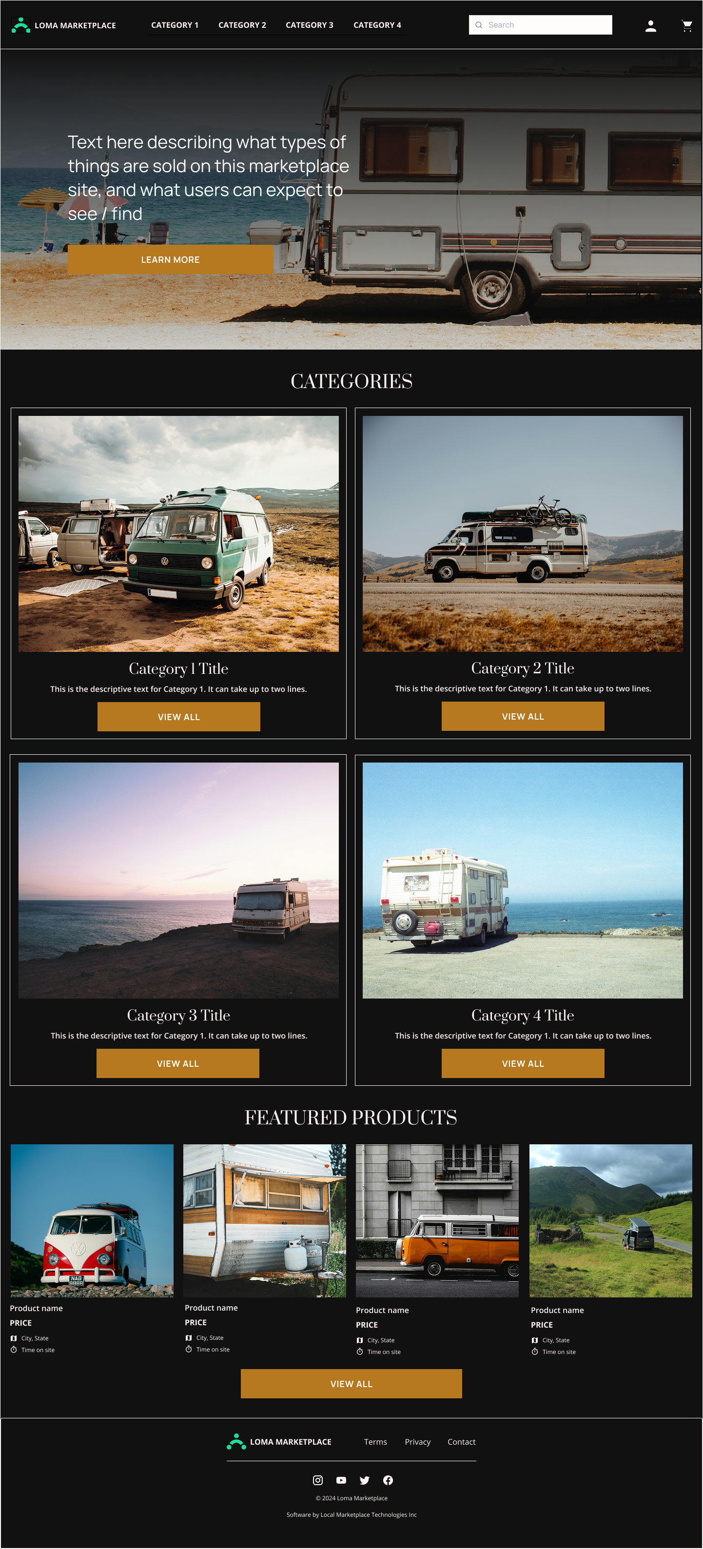
My primary focus was on the consumer-facing UI, which needed to be generated by the system with minimal user input. I designed two core visual themes—a standard layout and a more dynamic “magazine-style” layout—to give marketplace creators flexible but cohesive storefront options right out of the box.
In addition to the end-user experience, I led design for the marketplace admin tools, ensuring community founders could easily manage their products, orders, and storefront settings. I also designed a streamlined onboarding flow that served as the foundation for the AI-generated marketplace, capturing essential details like audience focus, founder bio, and brand identity.
Priority 1: Consumer-Facing UI Design
Example screenshots from initial audit
Wireframe examples
Final Design Examples

To design the user-facing marketplace experience, I partnered closely with engineering and the CTO to understand the underlying data structures and build a UI that was both flexible and robust. I conducted a full audit of the existing design artifacts and reviewed usage guidelines for the Chakra UI component library, which had been chosen prior to my engagement.
Collaborating with the CEO, I mapped out detailed user task flows based on previously conducted research. Although we didn’t have access to customers during the project timeline, I drew on established e-commerce UX principles and frameworks to ensure the experience would be intuitive and conversion-friendly.
A key feature of the product was visual customization—users needed to be able to make their marketplace feel like their own. I worked with the CTO and CEO to define which components and customization features were essential to empower that flexibility without overwhelming users.
All mobile screens for the consumer experience

Standard template examples
A key feature of the product was visual customization—users needed to be able to make their marketplace feel like their own. I worked with the CTO and CEO to define which components and customization features were essential to empower that flexibility without overwhelming users.
From there, I created wireframes to structure each page around the identified task flows, stress-testing layouts with the maximum amount of content and components to ensure scalability. Using Chakra UI’s design system, I developed two visually distinct templates—a standard layout and a more editorial “magazine-style” layout—each designed to be extensible and responsive to a wide range of content types.
Given the compressed timeline, our testing strategy was to launch and learn, with tight collaboration between design and engineering to ensure build sequencing aligned with our MVP priorities. We iterated quickly, balancing ambition with execution to deliver a functional, scalable marketplace experience for our initial users.

Magazine template examples
Priority 2: Marketplace Admin Tools
Admin page example
To shape the admin experience, I conducted targeted research with beta users—primarily community administrators—to uncover their current workflows, pain points, and expectations around managing marketplaces. This included understanding how they were currently handling storefront creation, product management, and community engagement outside of the platform.
Partnering with the CEO, I prioritized the most critical and frequently used admin tasks, ensuring the experience was both streamlined and intuitive.
Given the aggressive timeline, we opted to maintain visual and component consistency between the consumer-facing and admin tools. This decision allowed us to reuse core UI elements and styling conventions, simplifying both design and development using the Chakra UI library.
I conducted a second round of lightweight usability testing with the beta group to validate the updated experience. Based on their feedback, we made quick adjustments to better support real-world usage scenarios—resulting in a more intuitive, efficient admin interface that remained aligned with the broader product experience.
Priority 3: Customer Onboarding

Example onboarding screen
The onboarding flow for Loma was a 0→1 design challenge, as it had previously been handled through a fully manual process. My goal was to create a scalable, self-serve experience that could guide new users—from niche community leaders to individual creators—through launching their own marketplaces with minimal friction.
I mapped the end-to-end task flow, identifying key decision points and inputs needed to generate a fully branded, functional storefront. This included steps for entering founder information, defining the target audience, selecting brand colors, and choosing a layout style.
Alongside designing the interface and supporting screens, I also refined and updated Loma’s overall visual branding to ensure the onboarding felt cohesive, modern, and easy to complete—even for users without technical backgrounds.


